Fran Allfrey: 'Destroying Texts: Interview with Emily Lazerwitz'
Hi Emily! Here’s the document for the interview. See you on here! I’m just getting a cup of tea, in case you arrive on here and I seem to be gone!
Hello sorry I am late. Internet was down.
No worries!
You have your tea. Should we start?
At art school, Emily Lazerwitz was told that she was “’too smart to be a still-life painter’”. Her cursor flickers for perhaps 30 seconds, and I wait for her to tell me more. I imagine she grins, or perhaps grimaces, at the memory. “So to spite him I first made several oil paintings, but then decided maybe it was time to try something new,” the ‘something new’ being making work with text.
She continues, typing quickly, speedily correcting spelling, apparently preferring to delete a whole word or two using the backspace key than move the cursor to any errors using the mouse. It seemed fitting to carry out our interview via a live Google doc, with the majority of the journal and our collaboration being carried out via Dropbox and Gmail – but I realise that, as with the design process, we will miss each other’s gestures throughout this interview. So, I try to read her cursor, the movement of her words across the page, as you read a face or pointed finger.
I ask if she can describe her work briefly, and she is characteristically pithy, as in her emails: “I suppose I can say my practice is essentially destroying texts and reconfiguring them across different mediums.” The front cover of The Still Point Issue 1 is just one such destroyed set of texts. Emily, and editor-in-chief, Francesca Brooks, chose words and lines from pieces throughout the journal. Scrambled using a Vigenère cipher, with lines 64-68 of T S Elliot’s Burnt Norton as the encryption text, before being woven into a complex pattern, “a favourite of mine from American Folk Quilts”, these words have become a beautiful jumble of nonsense. SEB GDS KLT YVM IJG, reads the first line of the front cover: carefully crafted prose turned into codes for far-flung airports, perhaps.
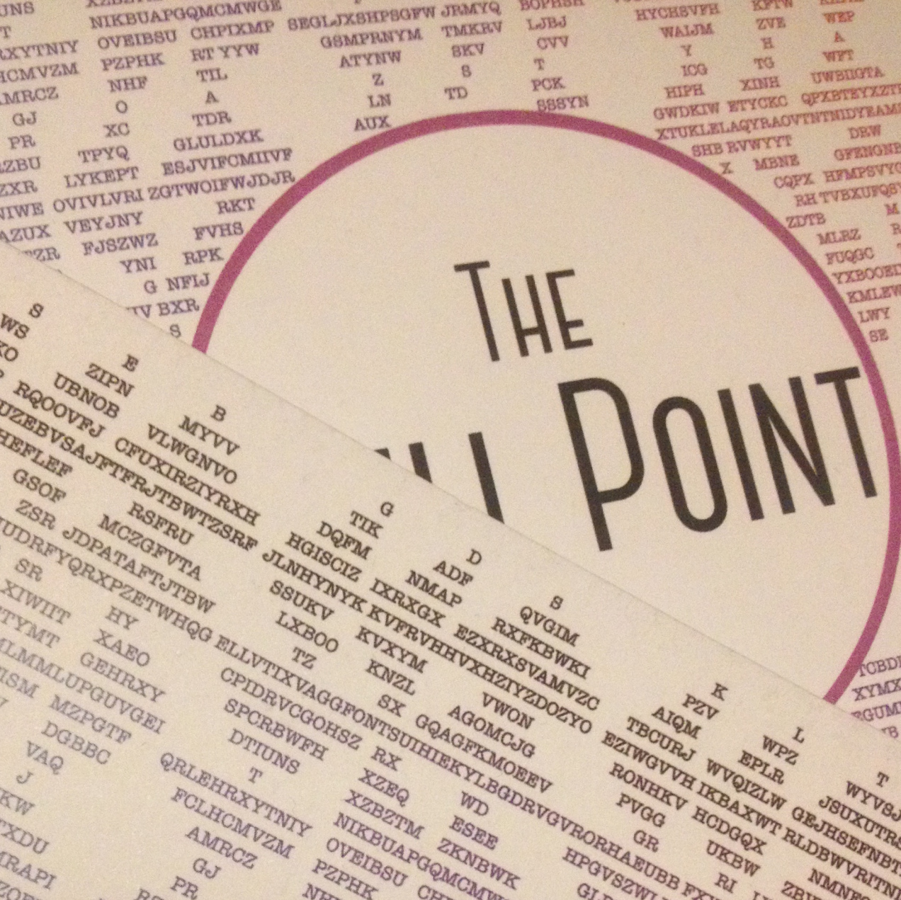
I use the word ‘woven’ to describe the piece, as although the work “took place in digital space through email and algorythms”, Emily explains, “when it came to typing out the cover, I did that all by hand. All hand typed line by line letter by letter”. This practice, which is mirrored across her art work, has a profound impact on Emily’s daily life, “the processes I use are very repetitive and tedious, so a lot of my day to day is simply making my work”. I see at once a classical or medieval weaver, fingers knotting and pulling, whilst Emily’s fingers move deftly over her keyboard, pulling, like so many threads, the different colours from the illustrations throughout the journal, delicately spinning them into the silken rainbow of the finished front cover. The arrow-shapes, pointing first one way then another, and the subtle gradients of tone give a sense of movement, of three-dimensionality, to an ostensibly flat surface: like folds of velvet across a table.
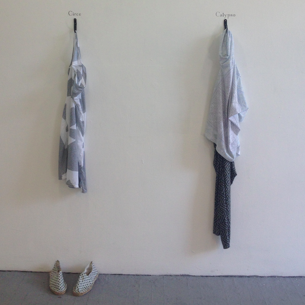
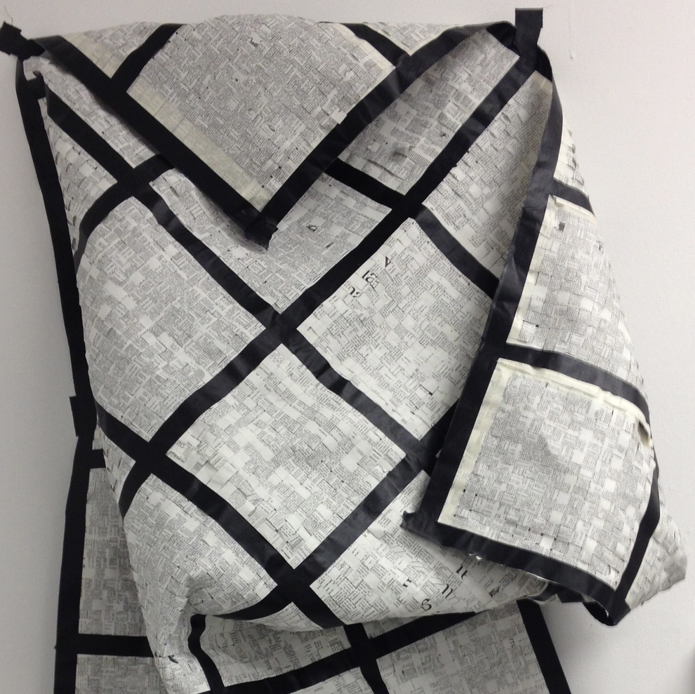
Perhaps though I am being influenced by knowledge of Emily’s other work, her printed fabrics, paper tapestries, and bespoke quilts, that also all rely so heavily on long, labour intensive, embodied processes, even when digital or mechanical technology is involved. We discuss how her design work for The Still Point fits into, or deviates from, her wider work. Her portfolio is full of textures: the woollen garments of The Nymphs [Circe and Calypso] (2015), the wafer-thin, brutally sharpie-d Holy Bible works (2015), the tape-and-paper of her Woven Dictionary (2014), each transforming letters to other letters, to binary, to symbols, to objects. So perhaps it is unsurprising that Issue 1’s front cover appeals so much to the sense of touch. Working in such physical ways with texts is a core part of her practice: her current project finds Emily “machine knitting large scarves based on the patterns of the redacted sections of CIA documents related to the case of Ethel and Julius Rosenberg. I am also screen printing these patterns on silk.” I hastily Google the Rosenbergs as we type, and feel myself pulled towards their story (one of the dangers of working online: the constant distraction of more things to read, more information to sift through).
But why is Emily drawn to these texts: what’s the link between the Bibles she first destroyed, and the ancient Greek stories, dictionaries, the CIA papers of her current work? “Mythology. The Bible is a textbook example of a myth, a widely believed story that is full of contradictions and inherently false. I guess the logic of the myth is what drew me to more classical examples like the Greek texts and to more recent government documents released due to the Freedom of Information Act. The mindset to believe them is all the same”. So her work teases out and tests the very narratives that their proponents would claim to be so solid. She jokes that because of the text-destruction inherent in her work “maybe I am not the ideal candidate for designing a literary journal”. But for me the fit is perfect: Emily shows us that the signs we so readily accept as significant can be, quite literally, unravelled, can be destabilised, reworked to signify anew.
The resulting mashed up texts, whether they are physically cut up, or scrambled with cipher software bestows on her work a sense of the uncanny – at once the codes seem futuristic yet ancient, the patterns speaking of both the Matrix and Assyrian cuneiform or pictograms. The slicing up or erasing of words at once feels dangerous, alluding to authoritarian censorship, yet also radical or – less politically – ludic, revealing new, unauthorised meanings in words and signs.
I ask her to explain the mystery of The Still Point’s front cover: “A Vigenère cipher basically uses a grid (like the one you can find on the back of Issue 1) where the y axis represents the letters used in the actual text, and the x axis uses the letters in the key word or phrase. Where those two letters meet on the grid is the new encrypted letter. For example…” There’s a long pause, she’s looking up the grid on the back of the journal, looking from book to screen to book, echoing the making process. I resist the urge to move my cursor. “Let’s say your key word is ‘dog’ and the first word of your text is ‘the’. Then you find the t in the y axis and the d in the x axis and locate them in the grid which would make the new letter which would be a W”. It seems the patience Emily needs in the making of her word is equally needed for its reading.
Aside from the front cover, Emily designed the artwork for most of the poetry pieces in Issue 1: much more of a divergence from her usual artistic practice. Emily explains the difference between designing for commission, and making art: “designing requires input other than my own and my art doesn’t. Design is collaborative and for me that is quite fun”, a rare opportunity to work with others. The artwork for the centrepiece of the journal, Mina Ray’s complex, multilingual poem, was triggered by the word ‘palimpsest’, and Mina “let me run with my idea of having illuminated manuscript pages ranging from traditional Islamic to traditional Christian patterning.” This bringing together of different traditions and signifiers reminds me again of a tapestry. And for Flair Donglai Shi’s pieces, Emily stitched together multiple elements, working intuitively with Flair’s words and images, and her own typography; as she so succinctly puts it, “it just kind of worked.”
The pleasure in working on something such as The Still Point Issue 1 comes exactly from this marrying of elements: word and image, physical and mental processes, the work of hands and minds. Emily tells me some of her influences, how she draws inspiration from artists including Charles Gains, Glenn Ligon, the philosophy of Walter Benjamin. By the end of the interview, and through this writing-up process, I have 18 tabs open, making links across Emily’s work, her inspiration, and other ideas, as they pull my cursor, my gaze, across Wikipedia searches and Google image results. Perhaps weaving describes the research process for so many of us, whether we make objects or words. Working with paper, pixels, ink, touchscreens, hyperlinks; our cursors and our fingers create a tapestry of them all.
Fran Allfrey designed the layout of Issue 1. She is a first year PhD candidate at King’s College London, exploring medieval texts and objects in contemporary cultural and creative practices. She also interviews PhD students (co hosted by TSP’s very own Charlotte Rudman) on KCL Radio’s Footnotes. Follow @francheskyia
Emily Lazerwitz is a second year MFA in Fine Art Media student at the Slade who enjoys making things impossible to read. She is currently creating work for her final Summer 2016 show. http://www.emilylazerwitz.com
